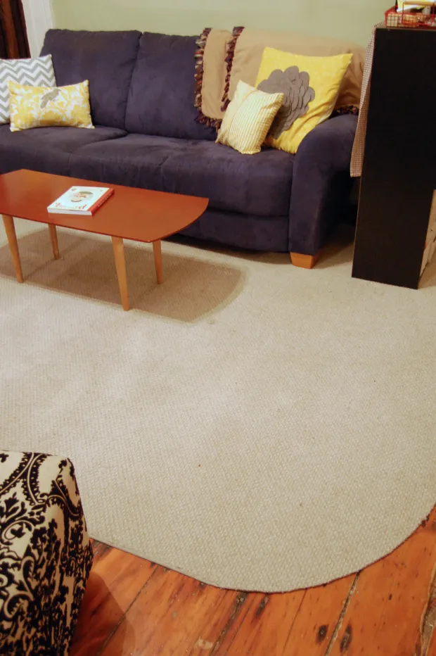
Choosing the perfect accent wall colour for every room in your home
An accent wall, sometimes called a feature wall, is one of the simplest ways to add personality to a room without committing to a full repaint. By isolating a single surface in a stronger, darker or more saturated hue, you create a focal point that anchors the space and gives the eye somewhere to rest. Done well, it can make a small room feel cosier, a long room feel more balanced, or a neutral scheme feel considered rather than flat.
In Australia, where homes often open onto decks, courtyards and landscaped gardens, an accent wall can also help define zones in an open-plan layout. From a light-filled Queenslander in Brisbane to a compact apartment in inner Sydney, choosing the right shade means thinking about how the room is used, how much natural light it receives, and the colours already living in your furniture, art and soft furnishings.
What an accent wall really does in a space
A feature wall works by breaking the visual rhythm of a room. When four walls share the same colour, the eye drifts around without ever landing. Introducing one contrasting or complementary surface changes that. It can highlight a fireplace, a bedhead, a built-in bookcase, or simply the wall behind the sofa, giving the rest of the room permission to stay quiet.
For open-plan living areas common in newer Melbourne and Perth builds, an accent wall can also do the work of a half-wall or screen. It marks where the lounge ends and the dining space begins, without interrupting sightlines to the garden or kitchen. If your home flows out to a courtyard or patio, you can echo tones from your planting to create a soft indoor-outdoor transition, picking up the greens of shrubs or the terracotta of pots in the paint you choose.
Reading light, size and orientation before you pick
The same colour can look dramatically different depending on where it sits in your home. North-facing rooms in Australia tend to receive warm, consistent light for most of the day, which can make cool blues and greys feel softer and a little greener. South-facing rooms, particularly in Melbourne and Hobart, get cooler, bluer light, so a wall that reads neutral in the shop may lean icy once it is on the plaster.
Room size matters too. Deep, saturated shades such as forest green, navy or charcoal can absorb light and make a small study or guest bedroom feel more enclosed, which is often exactly what you want in a reading nook but less useful in a tiny ensuite. Lighter accent walls in dusty rose, sage or soft terracotta tend to recede visually and can make a narrow room feel wider.
Always sample a colour on the actual wall, at the actual orientation. A two-metre stretch painted on the worst-lit wall of the room will tell you more than any paint chip ever could.
Building a palette around what you already own
The easiest way to find a shade you will still love in two years is to look at what is already in the room. Pull a cushion, a rug, a piece of artwork or a favourite throw onto the floor and notice the dominant tones. An accent wall should usually echo one of those existing colours, but in a more concentrated or contrasting form.
If your sofa is a warm grey and your curtains are oatmeal, a feature wall in deep mushroom, mossy green or muted ochre will feel intentional. If your space is full of white, black and timber, you have more freedom to choose something bolder, like ink blue or burnt sienna. Many Australian homeowners shop for paint at Bunnings, Taubmans or Dulux, where testers are inexpensive and staff can colour-match to a fabric swatch you bring in.
If you are working on a child's bedroom and want the wall to feel playful but not chaotic, tie the colour back to the rest of the scheme. Soft sage, dusty blue or warm clay all pair beautifully with timber furniture and white storage. Pairing a considered wall colour with smart space-saving pieces, such as well-made ikea bunk beds, helps the whole room feel pulled together rather than busy.
Letting mood and psychology guide your choice
Colour affects how a room feels before you even notice it. Warm hues such as terracotta, rust, mustard and deep rose tend to make a space feel welcoming, energetic and sociable, which is why they work so well in living rooms, dining areas and kitchens. Cooler shades like soft blue, eucalyptus, slate and lavender slow things down and are often the right call for bedrooms, bathrooms and studies.
Think about what the room is for. A home office in Adelaide where you take video calls might benefit from a calming but professional shade of muted teal or warm grey. A main bedroom retreat in a coastal suburb of Sydney could carry a soft, sandy beige that echoes the beach without leaning themed. A teen's bedroom might thrive on a more expressive colour, like deep plum or ink, balanced with plenty of soft white elsewhere.
If you are renovating or refreshing more than one room, think of your accent walls as a small collection rather than isolated choices. Repeating one or two colours across different rooms creates cohesion, especially in homes where the kitchen, living and dining areas sit within view of one another.
Testing colours in your own room
Never commit to a wall colour from a small swatch held against the existing paint. Buy sample pots, paint large A2-sized cards or directly onto the wall, and live with them for a few days. Australian sun is famously strong, so a colour that looks gentle at 10am may look washed out by noon and surprisingly warm by dusk.
Watch the swatch in morning light, afternoon light and under lamps at night. Notice how it sits next to your curtains, your floorboards and your skirting boards. If you have a particular artwork you want to hang on the feature wall, hold it next to the swatch as well. The relationship between an oil painting, a photograph and a painted wall can shift the perceived hue quite a bit.
It is also worth thinking about finish. Matte and low-sheen finishes absorb light and feel softer, which suits most feature walls. Semi-gloss or satin can look smart on panelling or wainscoting but will highlight every imperfection on a standard plaster wall, especially in older Federation homes where the surface may not be perfectly smooth.
Common pitfalls and how to sidestep them
One of the most frequent mistakes is choosing a colour that fights the undertones already in the room. Whites are rarely pure white; they carry traces of yellow, pink, blue or grey. If your trims are a warm white and you choose an accent wall with a cool blue base, the contrast can feel jarring. Look at the undertones first and choose a feature colour that respects them.
Another pitfall is treating the accent wall as an afterthought. It deserves the same attention as a piece of furniture, because in many ways it is one. Avoid painting the wrong wall, too. The wall behind the bedhead, the wall containing the fireplace, or the first wall you see when you enter the room are usually the strongest choices. The wall with the door, the window or the busiest architectural detail is usually the weakest.
Finally, remember that an accent wall does not need to be bright to be effective. In fact, the most sophisticated Australian interiors often rely on gentle, earthy tones that feel grounded rather than loud. Clay, eucalyptus, deep sand, ink and charcoal are all quiet but powerful choices, and they tend to age better than trend-driven brights. If you are also planning outdoor updates, browsing above ground garden plans can give you a sense of complementary greens and browns to borrow from, helping your interior palette feel connected to the rest of your home.