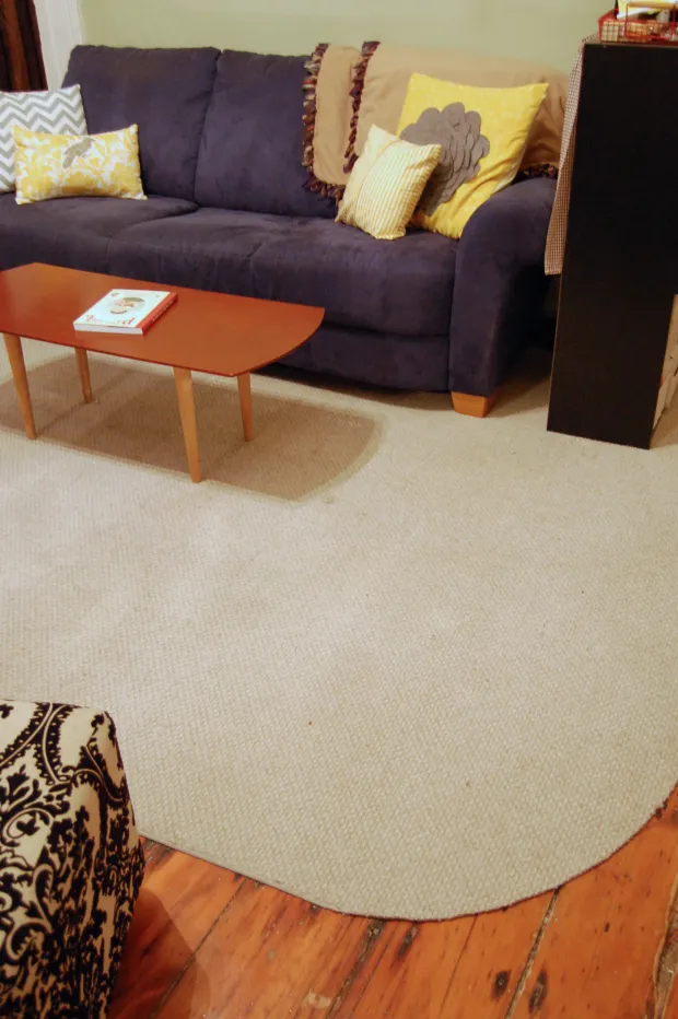
How to create a cohesive colour palette throughout your home
Walking through a home where every room feels connected, even when the spaces serve different purposes, is one of the quiet joys of thoughtful styling. A unified colour scheme does not mean every wall matches, but that a deliberate thread runs through the entire house, linking kitchen to bedroom and hallway to laundry. Many Australian homeowners discover this when renovating a Queenslander in Brisbane or updating a California bungalow in Melbourne's inner suburbs.
Colour shapes mood and acts as a visual language that guides the eye from one room to the next. A warm terracotta in the living area can echo softly down a hallway through a piece of artwork, then reappear as a cushion in a bedroom, creating continuity without repetition. The approach works particularly well in open-plan homes common across Perth and Adelaide, where sightlines stretch across multiple zones.
Building a palette that feels intentional rather than accidental takes time and a few practical steps. Creating harmony does not require a design degree or an unlimited budget. With observation, a willingness to test swatches, and a clear understanding of how light behaves in Australian homes, anyone can craft a scheme that feels pulled together. Readers looking for a structured starting point often explore resources like the styling guides to map out their vision.
The decision to unify colour across a home often comes after years of piecemeal decorating, when mismatched tones finally feel jarring. Rather than starting over, many homeowners find it easier to introduce a unifying thread gradually, weaving the new palette into existing pieces. This approach respects the budget while still moving toward a more harmonious result, a strategy that suits the practical mindset of renovators across the country.
Understanding the flow of colour from room to room
The first step is to think of the home as a single canvas rather than a series of disconnected boxes. Stand in a central hallway or open-plan living area and look toward each adjoining room. Notice the colours that already exist, from the tone of timber floors to the shade of kitchen cabinetry. These fixed elements form the foundation of any new scheme. In a typical Sydney apartment with polished concrete floors, the grey undertones of the slab can guide the selection of complementary paint colours.
Mapping the home on paper, even a simple sketch, helps clarify which rooms are visible from one another. In a two-storey townhouse in Melbourne's Brunswick or Fitzroy, the staircase often provides a key visual link. Choosing colours that gradually shift as you ascend, moving from deeper, grounding tones downstairs to lighter shades upstairs, can make the entire home feel cohesive. The aim is rhythm, with each room offering a variation on a shared theme.
Choosing a base colour that anchors the whole home
Every successful palette begins with a base colour, often a neutral, that appears in some form in every room. Whites, warm greys, soft taupes and gentle creams remain popular in Australian homes, partly because they pair well with the country's abundant natural light. A base colour might appear as the main wall colour in one room, the ceiling tone in another, and the backdrop for curtains or upholstery elsewhere. This repetition creates an invisible thread that ties the spaces together.
When selecting the base, consider the orientation of the home. North-facing rooms in Hobart or Canberra receive cooler light, so slightly warmer whites can prevent the space from feeling cold. South-facing rooms in Brisbane or the Gold Coast capture bright, warm light year-round, meaning cooler greys and crisp whites often work beautifully. Paint chips should be tested at different times of day, since Australian light can shift dramatically between morning and late afternoon.
Working with neutrals to bridge contrasting spaces
Neutrals do the heavy lifting in a cohesive palette, acting as the quiet backdrop against which bolder colours can sing. Beyond standard whites and greys, Australians are embracing warmer neutrals inspired by the landscape, think sandy beiges, eucalypt greens and clay-inspired terracottas. These earthy tones connect interior spaces to the natural environment outside, a relationship that feels especially fitting for homes with large windows overlooking the garden or bushland.
A practical approach is to choose two or three neutral shades and rotate them throughout the home. A warm putty might feature on the living room walls, the same colour reappearing on the bedroom built-ins, while a deeper mushroom grey anchors the home office. Layering different textures within the same colour family adds depth without disrupting the flow. For those tackling a weekend project, even a simple set of floating shelves painted in one of the chosen neutrals can carry the palette into a new space.
Using accent colours to create rhythm and interest
Accent colours bring personality and energy to a home, but without a plan they can quickly make a space feel chaotic. Selecting two or three accent colours and repeating them strategically across rooms creates a sense of movement. A mustard yellow cushion in the living room, a small framed print featuring the same hue in the hallway, and a vase of golden wattle on the dining table tell a continuous story as you walk through the home.
Australian homes lend themselves to accent colours drawn from the local environment. The deep teal of the ocean along the Great Ocean Road, the rust red of the outback, or the soft sage of native grasses can all become signature shades. When using bold accents, the 60-30-10 rule is a reliable guide: roughly 60 per cent base colour, 30 per cent secondary neutral, and 10 per cent accent. This balance keeps each room calm while still allowing the accent to make its mark.
| Scheme | Best for | Effect | Australian example |
|---|---|---|---|
| Monochromatic | Apartments, minimalist styles | Calm, restful | White flowing into dove grey in a Sydney studio |
| Analogous | Open-plan areas | Harmonious | Beige, terracotta and coral in a Brisbane Queenslander |
| Complementary | Homes needing energy | Vibrant contrast | Terracotta walls with teal cushions in a Melbourne terrace |
| Triadic | Family zones | Lively, eclectic | Mustard, teal and dusty pink in a children's playroom |
Layering textures and finishes to enrich the palette
A cohesive colour scheme depends on more than hue, since how surfaces interact with light shapes the final effect. Matte finishes absorb light and make colours feel softer and more grounded, while semi-gloss or satin finishes reflect light and can make a shade appear brighter. In a heritage home in Sydney's Paddington or a Victorian in Melbourne's Albert Park, the choice of finish can either honour the period character or introduce a contemporary twist.
Mixing materials is another way to enrich the palette without introducing new colours. A timber dining table, a stone benchtop, a wool rug and a ceramic vase can all sit within the same colour family while offering different visual textures. This approach also helps tie together rooms that have different functions, ensuring the eye reads the entire home as a single, considered space.
Considering natural light, climate and Australian conditions
Australia's intense sunlight and varied climate play a significant role in how colour is perceived indoors. UV exposure can fade certain pigments over time, particularly on north-facing walls, so choosing high-quality, UV-resistant paints is wise. In coastal areas like Byron Bay or the Mornington Peninsula, salty air can affect exterior colour choices, and some local councils have specific guidelines about colour schemes in heritage zones or areas governed by body corporate rules.
For homeowners building in bushfire-prone regions, the National Construction Code and Australian Standards such as AS 3959 may influence exterior material and colour choices. In designated Bushfire Attack Level (BAL) zones, darker exterior colours can sometimes affect the thermal performance of certain building materials. A quick check with the local council or a qualified builder ensures the chosen palette complies with any restrictions.
Refining the palette with samples and lived experience
No palette is truly complete until tested in the real environment. Paint sample pots are inexpensive, allowing swatches to be applied to large pieces of card and moved around the home over several days. Watching how the colour shifts from morning to dusk, and under both natural and artificial light, reveals subtleties that a small chip cannot. Many Australian homeowners visit their local Bunnings or independent paint supplier to gather samples, bringing home a small library of options.
Living with the colours for a week or two is just as important as the initial selection. A shade that looked perfect on the card may feel overwhelming on a wall, while another might grow on the eye. Once the palette feels right, small additions like coordinated cushions, artwork or a feature chair can reinforce the scheme. Readers ready to explore further can find inspiration by browsing the Jeeze Julia home page for room-by-room guides and seasonal ideas that complement their new colour story.