Picking Wall Art That Blends Beautifully With Your Decor
A single piece on the wall can quietly change everything about a room, pulling tones together, adding warmth, or signalling personality from the moment someone walks through the door. In Australian homes, where living spaces often flow into outdoor entertaining areas and natural light pours generously through wide windows, artwork tends to do even more heavy lifting. The right canvas can echo the colours of a coastal sunset over Bondi or pick up the soft greens of a native garden in Adelaide Hills.
Styling a room around a piece of art, rather than treating art as a final afterthought, has become the preferred approach for many interior enthusiasts from Perth to Hobart. It stops the all-too-common mistake of buying something pretty that ends up clashing with curtains, cushions, or the timber tones of a vintage sideboard. Choosing with intention creates harmony from the first coat of paint through to the last object on a floating shelf.
Scale, palette, subject, and frame are the four touch points worth thinking about before swiping a card or commissioning a piece. Each one interacts with the others, and getting a feel for their relationship takes the guesswork out of the process. With a little planning, the artwork you select will feel like it has always belonged.
Decoding Your Room's Colour Story
Before browsing prints at a Sunday market or scrolling online galleries, take a long look at what is already in the space. Notice the dominant tones in your soft furnishings, the warmth of the floorboards, and the undertones in your feature wall. A piece that pulls out an accent colour hidden in a lampshade or a textured throw tends to feel connected rather than imposed. Many Sydney decorators working with Victorian terraces find that earthy ochres and terracottas echo beautifully in contemporary textile art, while coastal apartments on the Gold Coast often shine with soft blues, sand neutrals, and the muted greens of seagrass.
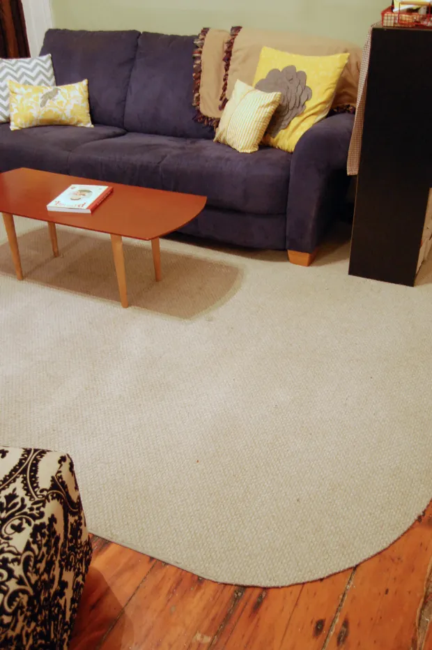
The 60-30-10 rule is a handy shortcut when working out which colours need support. Roughly 60 percent of a room sits in a dominant tone, 30 percent in a secondary shade, and 10 percent in an accent. Artwork is one of the simplest ways to introduce or reinforce that 10 percent without committing to a feature wall. If the accent in your living room is a soft mustard tied to a lamp on the sideboard, a piece with even a suggestion of warm yellow will instantly feel like part of the family.
For those leaning further into theme, considering the lighting changes throughout the day is worth the small effort. North-facing rooms in Brisbane can shift dramatically from cool morning light to intense midday sun, which means colours look completely different by evening. Choosing a piece with a layered palette rather than one flat tone will help it feel alive in any light.
Getting the Scale Just Right
Nothing throws off a styled room faster than a print that swims alone on a vast wall or a large canvas crammed above a small sofa. Scale is the silent hero of home styling, and it is where many first-time buyers stumble. A handy rule is that artwork should cover roughly two-thirds to three-quarters of the furniture beneath it, whether that is a bed, sofa, or buffet. In wide, open-plan homes common in newer Melbourne builds, oversized pieces often work far better than a cluster of tiny frames that get lost in the volume of the room.
For narrow hallways, a single tall vertical piece or a stacked pairing draws the eye upward and adds presence without crowding. In a snug inner-Sydney apartment, smaller thoughtful pieces arranged with intention create charm without overwhelm. Measuring your wall space and taping out the dimensions with masking tape before purchasing is one of the easiest tricks to avoid disappointment, and it works for everything from a vintage botanical print to a stretched linen canvas.
If committing to a bold statement piece feels intimidating, temporarily hanging a bedsheet in the chosen size can offer a surprisingly accurate preview. Many decorators working on heritage homes around Fremantle swear by this trick, especially when wall heights vary from room to room and ceiling roses need to be considered.
Choosing Subjects That Mean Something
The subject of a piece says as much as its palette, and connecting artwork to personal experiences makes a room feel distinctly lived in rather than styled from a catalogue. Travellers often return from places like Kakadu or the Margaret River region brimming with landscape inspiration, and a soft abstract inspired by those colours can hold wonderful memory. For others, still life prints, vintage posters from local theatres, or botanical studies of Australian natives such as waratahs and banksias offer a direct line to beloved plants and places.
There is no rule that art has to match the obvious theme of a room. A moody charcoal drawing above a relaxed coastal sofa creates the kind of contrast that feels curated rather than accidental. In Adelaide homes where mid-century furniture mixes with retro finds, abstract pieces with sculptural forms often sit beautifully alongside relics from the city's industrial past. Subjects that surprise tend to start conversations, and conversation is what a home is really for.
Mixing styles across a single wall, from a graphic line drawing to a richly textured oil, is also a valid creative move. The trick is letting one element unify them, whether that is a shared frame colour, a tonal thread, or simply a consistent hanging height. Treating the wall as a small gallery rather than a matched set opens up far more freedom when sourcing, especially for those who love wandering the pottery and craft stalls at Salamanca Place or browsing the weekend markets along Oxford Street.
Frame Choices That Tie Everything Together
Frames are often dismissed, yet they carry almost as much visual weight as the art itself. A heavy ornate gold frame suggests heritage and formality, while a slim raw oak tray speaks to relaxed contemporary living. The Australian preference for lighter timbers, particularly Tasmanian oak and blackbutt, means warm wood frames tend to integrate naturally with most decor styles. For renters, particularly those in inner-Brisbane apartments, going frameless with canvas or float mounts offers a clean look that does not require filling or patching on move-out.
Mixing finishes across a gallery wall is acceptable, but keeping one element consistent, such as mat colour, frame width, or hanging style, prevents the display from looking chaotic. White matting is a forgiving option that lifts darker pieces and softens busy compositions. For something more layered, gallery walls combining vintage rattan, painted timber, and sleek metal can be unified through a hanging line that runs at the same height across every piece.
If budget is a concern, IKEA Australia and large-format stores offer affordable frame options that can be painted or customised with timber moulding. A few weekends spent transforming basic frames with a coat of matte black or warm walnut can give an entire collection a cohesive edge without the price tag of custom framing.
Sourcing Originals and Prints Across Australia
Knowing where to look saves both time and money. Local markets remain one of the richest sources for accessible original work. Queen Victoria Market in Melbourne and Paddy's Markets beneath the Capitol Theatre in Sydney host regular artists with everything from small watercolours to large textured abstracts. Regional galleries and weekend art trails in places like the Hunter Valley and Byron Hinterland also turn up emerging artists at approachable prices before their work climbs in value.
Online platforms have made sourcing easier than ever, including local subscription services that support Australian artists directly. Looking at privacy information for online buyers before signing up to any platform is a sensible habit, since personal data handling varies widely. For something completely different, second-hand shops, particularly Salvos and Vinnies around the suburbs of Canberra, often hide framed prints or even original oils from estate sales at surprisingly low prices.
If the room requires something seasonal, particularly as the weather warms for outdoor entertaining, exploring holiday-ready styling tips for entertaining spaces can spark ideas. A resource like this dining table guide might sit well alongside artwork choices for shared entertaining areas.
Hanging, Spacing, and Grouping Like a Stylist
Hanging technique can make or break the final impression. The centre of a piece should generally sit at eye level, around 145 to 152 centimetres from the floor in most Australian homes, accounting for the average height of residents. For grouped displays, treat the entire cluster as one composition, then centre that arrangement on the wall rather than each individual frame.
Spacing between pieces matters more than most people realise. Aim for five to eight centimetres between frames for a tight, considered gallery feel, or ten to fifteen centimetres for something more relaxed. Using paper templates taped to the wall before committing to nails helps visualise both spacing and final placement, particularly for asymmetrical arrangements above hallways or behind low-slung vintage credenzas. If creating a living wall of greenery alongside artwork, follow a simple indoor seed starting walkthrough to plan trailing varieties that complement, rather than crowd, framed pieces.
For those collecting local artist prints or curious about regional exhibitions and creative networks, exploring the National Cultural and Creative archive and similar resources can open doors to lesser-known creators whose work suits small, characterful Australian homes. Combining thoughtful sourcing with confident hanging will leave walls that feel considered and unmistakably personal.