How to Use Neutral Tones Without Making a Room Feel Flat
Neutral décor gives a home a calm foundation, but a room built only from beige walls and matching furniture can quickly feel anonymous. The aim is to create quiet background space, then let light, material, shape and a few personal objects provide character. That balance makes everyday rooms easier to relax in while still looking considered.
The challenge of decorating with neutral tones without it feeling boring is rarely the absence of colour. It comes from too little variation in value, texture and scale. Pale upholstery, cream rugs and soft grey walls may harmonise beautifully, yet they can blur into one flat field. Contrast works better when it is deliberate and repeated in several small ways.
Australian homes make this especially interesting because daylight and daily habits vary so widely. Brisbane and Perth can deliver hard afternoon sun, while Melbourne often shifts between grey winter light and bright summer sun. Many Sydney terraces, Melbourne cottages and Adelaide homes have high ceilings, original mouldings and fireplaces that reward a layered approach rather than a single overwritten style.
A successful neutral scheme should still reveal who lives there and how the room is used. Keep the largest surfaces restrained, build interest at eye level and near seating, and choose accents that can change with the season or a new project. This creates a home that feels settled without looking as though every item was selected on the same day.
Choose a base for the light in your home
Begin with the room's existing architecture rather than a predetermined shade chart. Timber floors, stone benchtops, painted joinery and fireplace tiles influence whether a wall should lean warm or cool. Warm sand can make grey timber look muddy, while chalky off-white can sharpen it. In an open-plan home, sample the wall colour in the adjoining room because evening light can shift its undertone.
Paint and fabric samples need different viewing conditions. Put large samples on different walls and check them in morning, lunch and artificial light; small cards rarely tell the truth. A north-facing room may suit pale mushroom or greige more comfortably than stark white. South-facing spaces often suit cream, oatmeal or warm grey because these colours reflect limited daylight without turning cold.
The Australian homewares market makes it easy to mix price levels. Bunnings and Kmart offer accessible basics, while IKEA Australia supplies modular storage and lighting at mid-range prices. Rather than buying a matching set, choose one substantial piece, then combine it with secondhand finds from Gumtree or local op shops. Mixed origins are less visible when colour and scale are controlled.
Layer related shades with deliberate contrast
Layer the palette in related values rather than repeating one colour. An oatmeal sofa, mushroom chair, chalk walls and taupe rug create a gentle rhythm that still has visible edges. Warm neutrals such as sand, clay and putty suit timber, while cool stone and silver-grey work with metal and pale marble. A little temperature variation keeps the scheme from feeling overly matched.
In a Sydney terrace or Melbourne cottage with generous ceiling height, a budget crown moulding guide can show how architectural detail gives a plain wall a tailored edge for under $50. It echoes original proportions without requiring ornate decoration and works well against warm white or pale mushroom walls.
Layer window treatments as part of the palette, not just a functional gap. Linen-toned sheer curtains soften daylight without making a room feel formal. In Brisbane and Perth, UV-filtered roller blinds can control glare while a pale sheer preserves softness; in Melbourne, heavier curtains and a lamp add welcome warmth during grey afternoons. A slim pole can look sharper than a bulky track in a high-ceilinged room.
Let texture and pattern carry the visual interest
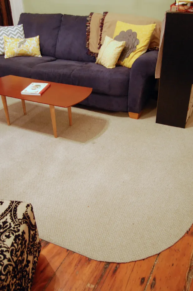
Texture is what separates one beige surface from another. Pair smooth plaster with nubby bouclé, crisp cotton with coarse linen, and polished timber with a woven jute rug. Wool and cotton also feel comfortable in Australian conditions without looking overly rustic. Let touch, rather than labels, guide the mix: a material can look relaxed in a coastal living room and still belong in a formal city apartment.
Pattern can provide the same effect without strong colour. Consider tonal stripes, faint checks, woven diamonds or oversized botanical motifs in barely contrasting shades. Place the strongest pattern on cushions or a throw, then echo its shape in a rug or artwork. This gives the eye a route through the room while preserving the calm base.
Scale matters as much as hue. A small pattern repeated across a large sofa can make the sofa look busy; one oversized motif on a simple chair can make a compact corner feel intentional. Test large proportions before committing, and leave breathing space around the focal item. Texture should do some of that work, especially when every visible colour is quiet.
Build one clear focal point
Once the base is settled, give the eye somewhere to land. A fireplace, artwork, sculptural lamp or painted cabinet can become the focal point, while everything around it steps back. In a neutral room, that one feature gains more presence because the surrounding surfaces do not compete for attention.
| Neutral palette | Character | Where it works well | Decorative move |
|---|---|---|---|
| Oat, sand and linen | Warm and soft | Living rooms and bedrooms | Add timber and woven fibres |
| Chalk and warm white | Clean and bright | Small rooms and kitchens | Introduce charcoal or deep green |
| Greige and mushroom | Balanced and versatile | Open-plan family spaces | Layer closely related shades |
| Stone and cool grey | Crisp and restrained | North-facing rooms and offices | Warm with leather, brass or rust |
| Charcoal and near-black | Dramatic and grounding | Fireplaces, cabinetry and feature walls | Keep nearby textiles pale |
If there is no chimney, a fireplace-style focal point can still anchor a lounge wall with layered lighting, artwork and a mantel-like ledge. Choose the feature to suit the room's proportions rather than forcing a standard arrangement into a small space.
Bring in colour through living details
Colour can enter through small, replaceable pieces rather than permanent paint. Ochre cushions, rust-red ceramics, deep green leaves or a blue-grey throw provide enough contrast to animate linen and timber. Repeat one hue in two or three places so the eye reads it as a deliberate thread, then leave some quiet space around it.
For households that move, this is especially practical. Washable cotton covers suit busy family rooms, while outdoor fibres and hard-wearing rugs handle sandy feet, pet hair and the weekly pile of beach or barbecue gear. A Sydney family room that opens to a deck can look polished without being precious.
Plants offer colour that changes without a shopping trip. A guide to edible flowers for salads is useful for pots near a bright kitchen window, where nasturtiums or violas can brighten both a worktop and a serving plate. Choose plants suited to local frost and humidity patterns, and use only correctly identified, unsprayed blooms that are safe to eat.
Spend where daily life takes place
Set the budget around touchpoints. A well-proportioned sofa, rug and curtains affect how a room feels every day, while small accessories can be gathered over time. Look for quality in joinery, fabric density and finish rather than a uniform product. Australian labels such as "made in Australia" can be useful, but check the specific material and workmanship rather than relying on the label alone.
Renters have fewer liberties than permanent owners, and the law varies by state. The Residential Tenancies Act 2019 in Victoria and the Residential Tenancies Act 2010 in NSW distinguish minor, reversible alterations from structural changes. Removable hooks and freestanding shelving are generally safer options; check the lease and seek consent before painting, drilling or altering a fixture.
Plan around Australian safety and energy habits as well. Keep heaters away from curtains and furniture, secure lamp cords out of reach of children, and have any hardwired lighting installed to Australian standards by a licensed electrician. Blackouts, summer storms and long evenings at home make layered task lighting more useful than a single harsh ceiling fitting.
Style in stages and judge the whole room
Style in stages rather than filling every surface at once. Photograph the room at different times, move one large item, and live with the change for a week before buying more. For extra visual references, the Gambellara design resource can sit alongside your own samples, but the final test should be how the room supports your household's routines.
A room can remain restrained and still feel alive. The strongest neutral schemes use proportion, tactile contrast, balanced negative space and a few colours that belong to the people in the home. Once those elements agree, the space feels composed rather than decorated, with no need for visual noise.