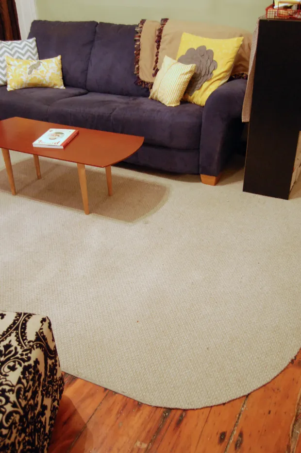
Pattern Mixing Without Visual Noise
Learning how to mix patterns in a room without overwhelming it begins with treating pattern as a visual hierarchy. Stripes, checks, florals, ikat, terrazzo and geometric shapes can share a space when one leads, another supports and the smallest motif adds punctuation. Maximum variety is rarely the aim; the aim is a sequence the eye can follow without feeling tripped up at every turn.
Start with the largest, strongest or most colourful element already in the room. A patterned sofa, tiled splashback, floral curtains or boldly striped rug will carry more visual weight than a cushion, so the other patterns should respond to it rather than compete. This approach works beautifully in compact Australian interiors, where one considered feature can give a room character without filling every surface.
Choose a Leading Pattern
Treat the dominant pattern as the room’s main character. It might occupy a large rug, define the seating area or run through full-length curtains. Supporting patterns can contain one of its colours, echo its shape or contrast with its scale. Accent patterns should appear in smaller doses, such as one lamp shade, two cushions or a narrow strip along a shelf.
A flexible starting ratio is roughly sixty per cent leading pattern, thirty per cent supporting pattern and ten per cent accent. These proportions are guides rather than strict rules, especially in a room shared by children, pets or a busy collection of belongings. If the floor and sofa are patterned, keep the walls calm and let accessories supply controlled contrast.
Australian shoppers can build a palette affordably from Bunnings, Kmart, Target and IKEA Australia, then hunt through pre-loved marketplaces for one distinctive older piece. Mixing price levels is sensible because a secondhand chair or thrifted framed print becomes an accent rather than another major expense. As one Aussie decorator might say, “That chair looks beaut, but the rest can stay quiet.”
Before buying another patterned object, consider whether an existing piece can change roles. A solid coffee table might take on a striped runner, while a plain chair could become the room’s pattern carrier. For furniture that needs a colour reset, furniture refinishing guidance can help you assess scratches, preparation and finish before deciding whether restoration will give a piece new life.
Balance Scale, Colour and Contrast
Vary the size of your patterns while keeping their visual weight related. Tiny checks beside broad stripes create movement without demanding equal attention, while a large floral balanced with a small geometric print keeps both motifs recognisable. Repeating the same pattern at several identical scales can flatten a room; changing scale gives it depth.
Connect everything through two or three shared colours. A navy-and-cream striped blind might lead, a cream floral could support it and a navy cushion can bridge both. Warm neutrals—oatmeal, clay, olive, timber and soft white—often sit comfortably with many patterns found in Australian furnishings. They provide pauses between busier surfaces and make colour changes feel deliberate.
Strong daylight can shift the balance throughout the day, particularly in rooms facing north or west. Hold inexpensive fabric swatches against windows, curtains and walls, then check them again in the evening. Colours that clash in harsh light may disappear under softer lamps, while subdued combinations can suddenly become lively beside a warm bulb.
Edit the supporting objects before adding anything new. Excess is often mistaken for pattern overload, especially when books, baskets and small decorations gather on every available ledge. The gentle room decluttering approach is useful here: remove a few small items at a time and notice which patterns become clearer. Odd quantities of coordinated pieces often look more relaxed than rigid pairs.
Create Rhythm Through Shape and Repetition
Shape influences pattern balance as much as colour does. Angular checks and sharp geometric prints benefit from curves nearby, supplied by an oval rug, round table, arched artwork or softly patterned cushion. Florals and leafy prints naturally temper straight stripes, while circular motifs can soften the hard edges commonly found in tiled Australian kitchens and rendered bathrooms.
Repeat each pattern or colour at intervals so the eye can travel through the room. Three appearances of a small motif can feel intentional when they are spaced apart, while three large versions may become monotonous. Keep some surfaces plain between featured areas and vary the direction of lines: vertical stripes can lift a low room, while horizontal bands can visually broaden a narrow one.
Repetition does not require buying a matching set. A colour repeated in a rug, artwork and bedside lamp can achieve the same continuity as three coordinating cushions. If existing pieces feel unrelated, choose one common tone and gradually introduce it through smaller items rather than replacing the whole room.
Words and lettering can work like pattern when framed graphics are treated as broad blocks of tone. Even if the text is unreadable from the sofa, its shapes may balance a floral or geometric design. For visual inspiration, the archive at Typecon 2004 offers an interesting counterpoint to the stripes and organic motifs used around it.
Account for Australian Light and Climate
Test the combination under the conditions of the actual room. In a bright Sydney apartment, pale patterns may look stronger against exposed brick or cream walls. A compact Melbourne terrace can gather visual texture quickly because furniture often occupies adjoining rooms, making continuity across doorways important. Brisbane family rooms face different demands, including humidity, spills and strong afternoon sun.
Choose materials that can cope with Australian conditions without losing their colour. Check fading ratings for curtains, cushions and rugs near sunny windows, and avoid placing delicate textiles where they will collect dampness. The busy-ness of a pattern changes with the seasons as sunlight shifts across a timber floor or rendered wall, so several days of observation can be more useful than a single snapshot.
Greenery introduces organic pattern without adding another manufactured motif. Large leaves create movement, trailing plants soften shelving, and grouped pots can establish rhythm along a windowsill. For rooms where watering is easy to forget, easy-care indoor plants offer useful starting points. Choose pots in a repeated neutral colour so the foliage, rather than the containers, becomes the accent.
Stand back from the doorway, then view the room from the main seating position. Strong clashes are often visible from a distance, while small colour differences become apparent up close. Photograph the room at morning, midday and evening if possible; each image reveals which pattern is leading and whether the room still has enough calm space.
Edit With Restraint and Reuse
A successful mix becomes clearer through subtraction. Remove one small patterned object and assess the room before making another change. This is particularly valuable when preparing a home for a new baby, updating a playroom or making a shared space calmer for two people with different tastes. Practical pieces can retain their usefulness while quieter accessories handle the visual interest.
Reuse what you own by moving, regrouping or temporarily storing it. A pair of cushions can move from a sofa to two bedside tables, while a patterned throw can shift from the sofa to the end of a bed between colour schemes. For renters, removable picture strips, freestanding frames and tensioned curtain rods allow experimentation without permanent changes.
Budget and quality are not opposites. Spend where an item will be touched or used daily, then save for smaller accents that can be changed seasonally. Local makers and Australian artists can provide a distinctive print without requiring every piece to come from one collection. Keeping the palette consistent makes inexpensive accessories look considered alongside more substantial furniture.
If a room still feels unresolved, gather measurements, photographs and a list of pieces you want to keep before changing anything further. A second perspective can reveal an uneven colour balance or an overcrowded surface. You can share the room details through a project photo enquiry. Once every pattern has breathing space and one motif clearly leads, the result feels layered rather than loud—a calm, collected rhythm that changes with the day.